This article is based on my very first talk, presented at Human Talks Grenoble on December 9, 2025. Here, I expand on the topics covered and add additional resources.
Dark mode has become a standard that users expect. Yet its implementation is often poorly done, even by tech giants. LinkedIn limits the choice to the device setting, Spotify offers no option at all. Inconsistency is the norm.
I wanted to understand why, and more importantly, how to do better.
The real goal: contrast, not theming
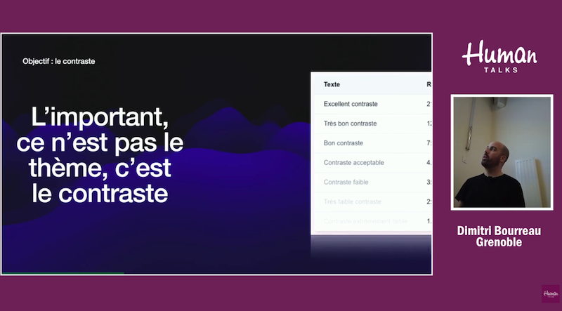
Before talking about implementation, let's set the groundwork. What matters is not the theme, it's the contrast.
A poorly contrasted dark theme is worse than a well-contrasted light theme. The WCAG (Web Content Accessibility Guidelines) recommends a minimum contrast ratio of 4.5:1 for normal text, and 3:1 for large text (18px+ or 14px+ bold).
| Ratio | Level |
|---|---|
| 21:1 | Excellent |
| 12:1 | Very good |
| 7:1 | Good (AAA) |
| 4.5:1 | Acceptable (AA) |
| 3:1 | Weak |
| < 3:1 | Insufficient |
These ratios are not arbitrary. Since June 2025, the European Accessibility Act (EAA) mandates compliance with WCAG 2.1 level AA for digital services in Europe. It is now a legal requirement.
Contrast is easy to check in Chrome DevTools: select an element, click on the color in the Styles panel, and the ratio is displayed along with AA/AAA badges.
Bad examples
LinkedIn offers a dark mode with three options: light, dark, or follow the device. That's good.
But the implementation suffers from inconsistency: the default theme is always light, even if the user's device is set to dark mode. The user experience suffers as a result.
Spotify
Spotify goes even further:
- No choice: dark mode is forced, no light theme available
- Inconsistency: same as LinkedIn
Common pitfalls
1. Inconsistency
The most frequent pitfall. To avoid it, three solutions:
- Adopt the OS theme by default via
prefers-color-scheme - Let the user choose a different theme
- Persist that choice (cookie, localStorage, or database)
2. Flash Of Unstyled Content (FOUC)
This is the white flash you sometimes see when loading a site in dark mode. The sequence goes like this:
- The page loads with the HTML (white background by default)
- The CSS is applied
- JavaScript executes and applies the
darkclass
Between step 1 and step 3, the user sees a white screen. It's unpleasant, especially in a dark room.
Why does this happen?
FOUC occurs when the dark theme depends on JavaScript execution. By default, Tailwind v4 uses @media (prefers-color-scheme: dark) for the dark: variant. It's purely CSS, so no flash.
But as soon as you want to allow a manual choice (with a .dark class on <html>), you depend on JavaScript, and the flash appears.
The solution: run JS in the <head>
<head>
  <script>
    const theme = document.cookie.match(/theme=(\w+)/)?.[1]
    if (theme === 'dark') {
      document.documentElement.classList.add('dark')
    }
  </script>
</head>
This blocking script executes before the body is rendered. No flash.
3. Neglected contrast
You create a dark theme, invert a few colors, and forget to check the contrast. Result: gray text on a dark gray background, unreadable.
Solutions:
- Use DevTools to check every combination
- Integrate Lighthouse into your CI
- Automate accessibility testing with Playwright or Cypress and axe-core
Implementation with Next.js and Tailwind v4
Here is the approach I recommend, available on my demo GitHub repo.
1. Configure Tailwind to use a class
By default, Tailwind v4 uses the media query. To allow a manual toggle, you need to associate the dark variant with a class:
@import 'tailwindcss';

@variant dark (&:where(.dark, .dark *));
This line tells Tailwind that dark: applies when the element or one of its ancestors has the .dark class.
2. Read the theme server-side (Next.js)
To avoid the flash AND get correct server-side rendering, we read the cookie on the server:
export default async function RootLayout({
  children,
}: {
  children: React.ReactNode
}) {
  const cookieStore = await cookies()
  const theme = cookieStore.get('theme')?.value

  return (
    <html lang="fr" className={theme === 'dark' ? 'dark' : ''}>
      <body>{children}</body>
    </html>
  )
}
The cookie is read before the HTML is rendered. The .dark class is present from the very first byte sent to the client. No flash.
3. The toggle component
'use client'

export function ThemeToggle() {
  const toggleTheme = () => {
    const isDark = document.documentElement.classList.toggle('dark')
    const theme = isDark ? 'dark' : 'light'
    document.cookie = `theme=${theme}; path=/; max-age=31536000`
  }

  return (
    <button onClick={toggleTheme} aria-label="Changer de thème">
      Toggle
    </button>
  )
}
The toggle instantly modifies the class AND persists the choice in a cookie. On the next page load, the server will read that cookie.
4. Respect the OS preference by default
If no cookie exists, you can respect the OS preference with an inline script:
<script>
  if (!document.cookie.includes('theme=')) {
    if (window.matchMedia('(prefers-color-scheme: dark)').matches) {
      document.documentElement.classList.add('dark')
    }
  }
</script>
Automated testing
Accessibility can be tested automatically with Playwright or Cypress and axe-core. Here is an example with Playwright:
import { test, expect } from '@playwright/test'
import AxeBuilder from '@axe-core/playwright'

test('should not have accessibility violations', async ({ page }) => {
  await page.goto('/')
  const results = await new AxeBuilder({ page }).analyze()
  expect(results.violations).toEqual([])
})
This test fails if the contrast is insufficient. Integrated into your CI, it prevents regressions.
Conclusion
- Excellent contrast is more important than any theme
- Test contrast in both themes, not just the one you use
- Avoid FOUC by reading the cookie server-side or placing JS in the head
- Test automatically with axe-core in your CI